All images copyright © Семён Мотолянец 2018
Soap Root. One of the main problems of contemporary art is its excessive physiology. And by «physiological» is meant here a certain strong and unpleasant emotion that many works evoke; so their meaning is certainly understandable, but it is impossible to allow any close contact with them in one's mind. The flip side of this is sterility in art. When any close contact is possible, simply because no effect is certain. Either a pastose-infected philosophy or its distilled version saturates the works. The group Soap has a unique talent for the current St. Petersburg art scene for creating a real philosophy in artistic gestures. Without unnatural gestures. With a clearly articulated creative method. And although the literal adherence to a single theme becomes a trap for many artists, SOAP group demonstrated amazing forms of application and integration of the spectrum of ideas to a single technique. Their creative exploration evolves in an upward spiral. From covered in the simplest form of mass performance art, to limitlessly chamber-like stories for a single audience. It is certainly fascinating. And determining the reason is impossible - and unnecessary. Because the proverbial «true art» must include light in the soul of the beholder, not fractionalism in his mind. The «Rejection» project at Anna Nova Gallery can be characterized as a museification of the simplest. The very idea of creating an exhibition unfolding according to the laws of the classical research museum seems to be such a charming device that it knocks down any false pathos of retrospectiveism. Anna Buivid
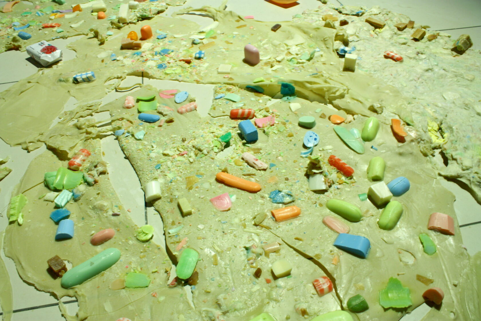
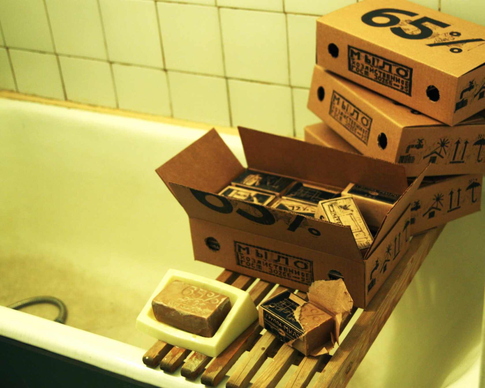
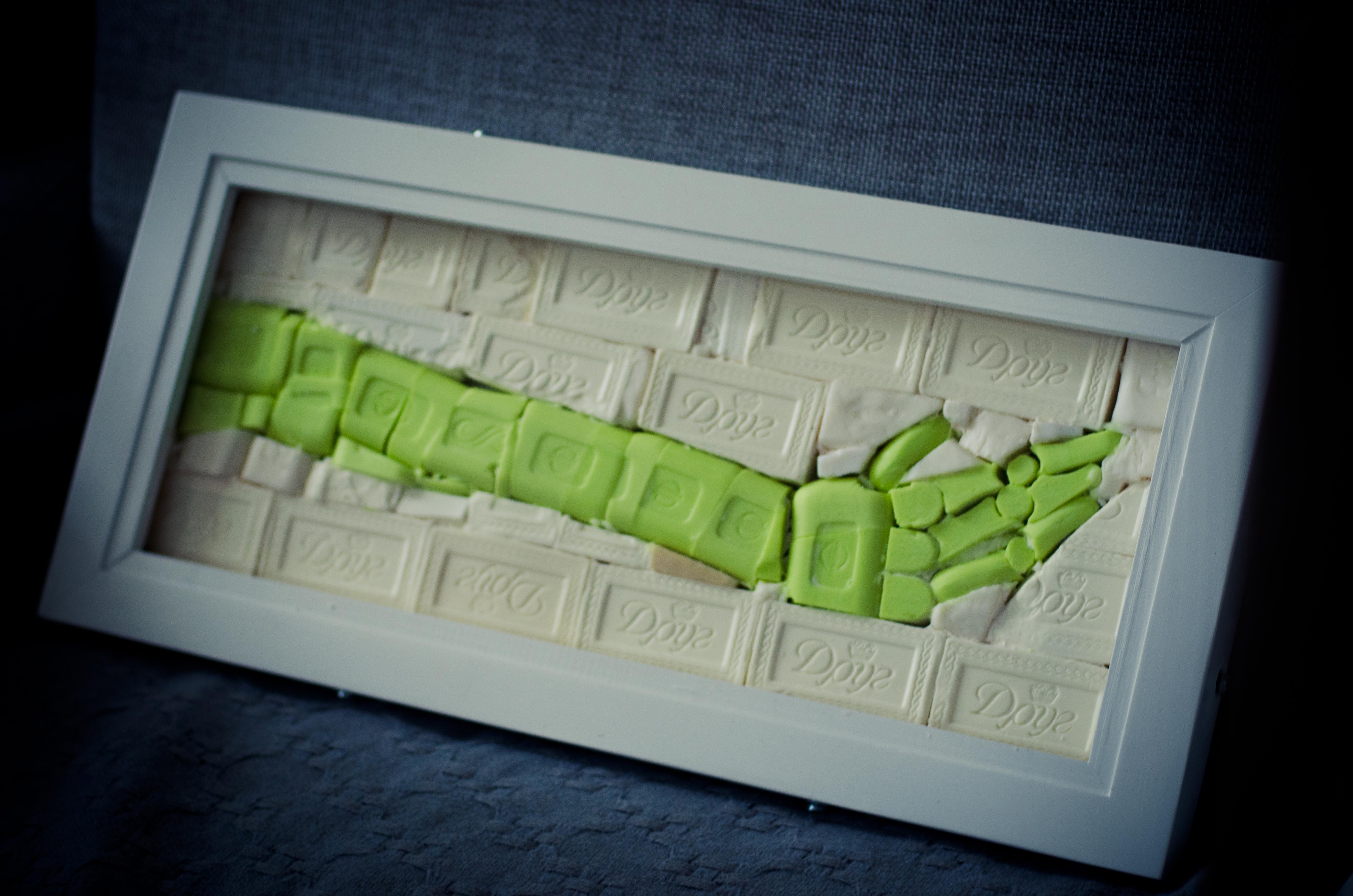
Printed graphics was invented as a technique to produce enormous print runs of images. Today, the printer, copier, and other office equipment have supplanted the printing press's printmaking capabilities, giving printmaking back to the «big art». But in the idea of the language of printmaking still lives its original intent to simplify image acquisition and the ability to create more «accessible art». Ideas of infinite image acquisition surround us in the form of an abundance of visual products of utilitarian significance. Millions of packages of various goods roll off the assembly line, each one designed by the person sitting in the office who designed it. Day after day, thousands of images go into the trash that make up the visual garbage. Throwing out the trash in the puchto, I noticed that there are solid images and letters - the wrapping of different products and other goods, if you wanted you could read texts in small print on the back of packages all day long and look at pictures of images from tea bags, mayonnaise jars, etc. In the warehouses, among the thousands of boxes printed in unpretentious text patterns, there are images full of texture reminiscent of the possibilities of print graphics. I've always wondered that there are people who design pictures for candy wrappers, people who come up with names for candy wrappers - their names will remain anonymous, but their visual product will affect the visual perception of our time, their images will be much more often in the field of vision than paintings hanging in private interiors. And this idea is actually not new, this is the principle on which the artists of pop art reasoned. The famous Kemble soup can is the best example. The experience of this project is an intrusion into the zone of the utilitarian image not with pop-art ideas but with a «pictorial language». I still wonder who did the matchbox packaging project in the late nineties and why: a black camel on a yellow background, a green decorative house and many other crazy designs (there were different images in different places). The place of such images among the garbage in the human dumpster of visual abundance of secondary pictures with utilitarian value. Today, pictures on labels, advertisements, magazines and many other things have become part of our nature, they seem to have no author, as if they were born by nature. The project consists of a graphic series of 18 sheets in which soap is wrapped, which are in one folder - a box (to combine the series), the pieces of soap wrapped in printed sheets are designed to deliberately devalue the products of printed graphics. The main thing here is the soap, not the wrapper. The soap inside causes the label to tear, ridding the sheets of their belongings of the unwarranted burden of «great art» or, more precisely, «great technique».
